Mobile phones have a couple of options when rendering existing web pages: they can render a page at the native resolution of the screen, or they can render it on a larger virtual screen and then “zoom out” so that the whole page fits on the screen. The virtual screen is called the “viewport.”
Ideally screen resolution shouldn’t matter for the web, but many existing pages on the web won’t render well at a smartphone’s native resolution. After all, even in 1993 when the web started, most screens were at least 640 pixels wide. The iPhone by contrast is 320 pixels by 480 pixels[1]. Over the years, web designers have assumed that there will be at least that much width to lay out their pages across, and don’t consider how layouts break when the screen is narrower. In order to render all these existing web pages well, mobile browsers choose the path of rendering to a larger viewport and scaling the content to fit the page on screen. Safari on iOS uses 980 pixels as the default viewport width.
When targeting a web page at small screen devices, it could be nice to have the screen resolution match the viewport size. The viewport meta tag was introduced to allow a designer to request exactly that, that the phone should render the page at its native resolution.
As explained in the Safari html reference, there are six things that can be specified on the meta tag:
We found out early on in the Democracy Now! mobile site project that some of the attributes in combination have some surprising effects when combined with rotating the device. Ultimately, initial-scale turned out to be the culprit.
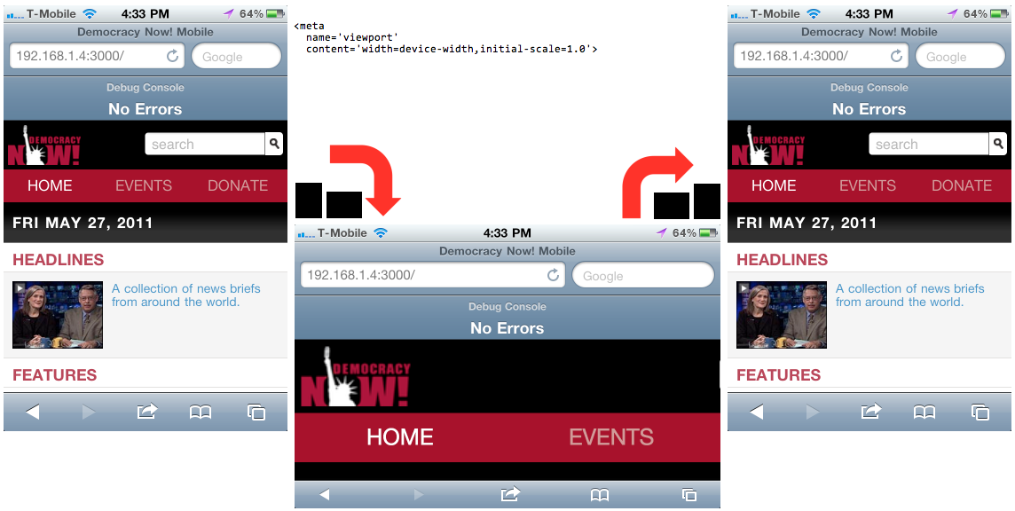
My initial guess based on the documentation was to set both width and initial-scale, but this causes the site to be “too wide” when the phone is rotated from portrait to landscape:

1 | <meta name='viewport' content='width=device-width,initial-scale=1.0'> |
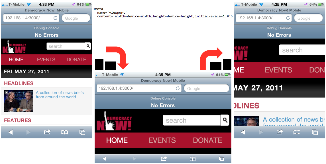
Second thought was to set height as well as width, and initial-scale. This makes the portrait to landscape rotation work as expected, but causes a similar “too wide problem” when rotating from landscape to portrait:

1 | <meta name='viewport' content='width=device-width,height=device-height,initial-scale=1.0'> |
The solution turned out to be not setting initial-scale at all. Device-width is enough to set the viewport width to the real width of the device, and a scale is not needed – 1.0 is assumed it would seem.

1 | <meta name='viewport' content='width=device-width'> |
When I come across a bug like this, I like trying to come up with a mental model of what is going wrong in the code to create the undesired behaviour. This is useful when debugging my own code and useful when trying to work around apparent bugs in other people’s code.
I haven’t built a good mental model of what is going wrong here. My best guess is that the width and the scale are being decided at different points during a rotation, and are getting out of sync. In the first example it could be that the width and scale are decided before rotation: 320 and 1.0. Then during rotation scaling and width are both changed, but independently. For scale, it is decided that 320 viewport pixels are now being rendered across 480 physical pixels, so scale factor can be 3/2 (three physical pixels for every 2 virtual pixels). Independently, it is decided that the page can now be rendered across 480 pixels. We end up with a viewport that is 480 virtual pixels wide, scaled by 3/2 so that only 320 of those pixels are in the visible area.
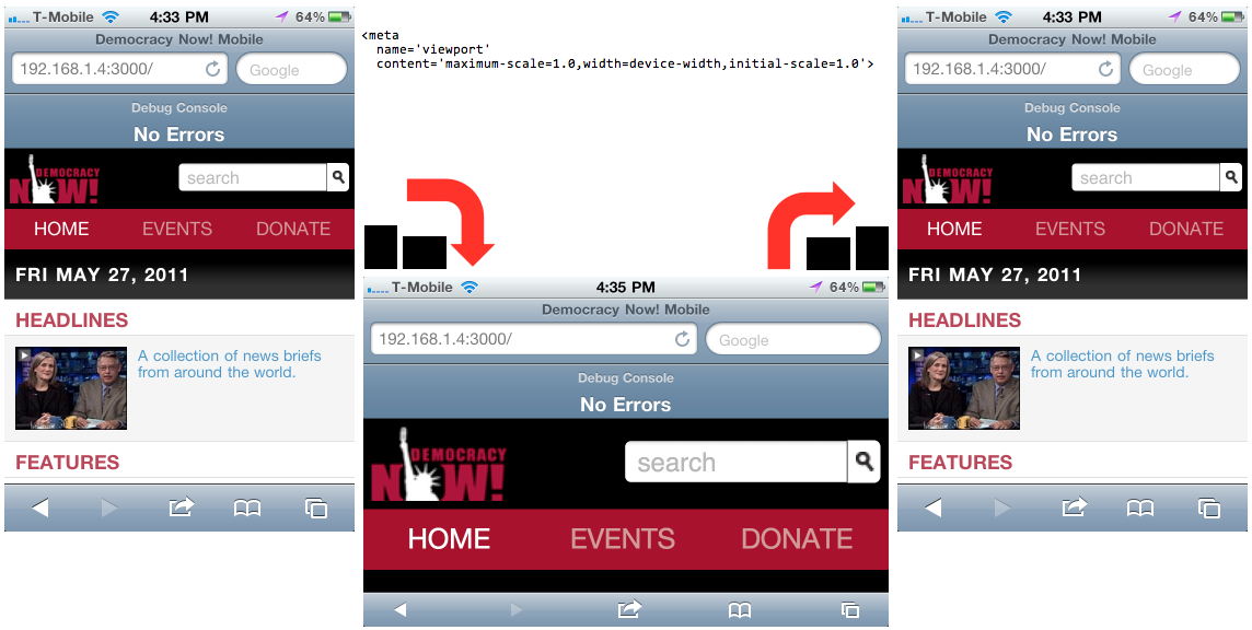
This model suggests another possible fix. If the model is correct, constraining the scale-factor to 1.0 would fix the problem. Only the number of available pixels will change, rather than both scale and width at the same time. The downside of this solution is that the user would no longer be able to zoom in. Trying it out, it works:

1 | <meta name='viewport' content='maximum-scale=1.0,width=device-width,initial-scale=1.0'> |
The movement after a rotation as the page recombobulates itself seems revealing. It is different for each of the above combinations. I can’t show transitions here; you’ll have to try them out yourself to see.
In the end, we went with the solution of only specifying ‘width=device-width’. This worked well on the iPhone and on other browsers. Other browsers have different freaky scale things that happen after a rotation, including one bug that is still affecting us on Android 2.1.
Thanks to Dani Schufeldt for testing and raising this defect until it was fixed properly, and Ted Nielsen for working the layouts around it.
[1] I’m ignoring the double-density iPhone 4 screen, because I can’t remember the separate terminology to keep it all straight. I might come back later and edit the blog post.